GeoDistanceSlider creates a location search based range slider UI component that is connected to a database field. It is used for distance based filtering.
Example uses:
- finding restaurants in walking distance from your location.
- discovering things to do near a landmark.
Usage
Basic Usage
<ReactiveBase
  mapLibraries={['places']} // required
>
    <GeoDistanceSlider
        componentId="locationUI"
        dataField="location"
        range={{
            start: 0,
            end: 20,
        }}
    />
</ReactiveBase>
Usage With All Props
<ReactiveBase
mapLibraries={['places']} // required
>
<GeoDistanceSlider
componentId="GeoDistanceSensor"
dataField="location"
title="Geo Distance Slider"
range={{
start: 0,
end: 20,
}}
rangeLabels={{
start: '0 mi',
end: '20 mi',
}}
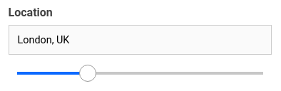
defaultValue={{
location: 'London, UK',
distance: 12,
}}
countries={['uk']}
placeholder="Select a distance range.."
unit="mi"
autoLocation={true}
showFilter={true}
filterLabel="Location"
URLParams={false}
onData={
(prop) => {
const {value, error} = prop;
// do something
}
}
/>
</ReactiveBase> Props
componentId
| Type | Optional |
|---|---|
String |
No |
unique identifier of the component, can be referenced in other components' react prop.
dataField
| Type | Optional |
|---|---|
String |
No |
data field to be connected to the component's UI view.
nestedField
| Type | Optional |
|---|---|
String |
Yes |
use to set the nested mapping field that allows arrays of objects to be indexed in a way that they can be queried independently of each other. Applicable only when dataField is a part of nested type.
title
| Type | Optional |
|---|---|
String or JSX |
Yes |
title of the component to be shown in the UI.
range
| Type | Optional |
|---|---|
Object |
Yes |
an object with start and end keys and corresponding numeric values denoting the minimum and maximum possible slider values.
rangeLabels
| Type | Optional |
|---|---|
Object |
Yes |
an object with start and end keys and corresponding String labels to show labels near the ends of the GeoDistanceSlider component.
defaultValue
| Type | Optional |
|---|---|
Object |
Yes |
pre-select the search query with location option and distance with distance option.
placeholder
| Type | Optional |
|---|---|
String |
Yes |
set the placeholder to show in the location search box, useful when no option is defaultValue.
value
| Type | Optional |
|---|---|
Object |
Yes |
controls the current value of the component. It sets the location & distance (on mount and on update). Use this prop in conjunction with onChange function.
onChange
| Type | Optional |
|---|---|
function |
Yes |
is a callback function which accepts component's current value as a parameter. It is called when you are using the value prop and the component's value changes. This prop is used to implement the controlled component behavior.
showIcon
| Type | Optional |
|---|---|
Boolean |
Yes |
whether to display a search or custom icon in the input box. Defaults to true.
iconPosition
| Type | Optional |
|---|---|
String |
Yes |
sets the position of the search icon. Can be left or right. Defaults to right.
icon
| Type | Optional |
|---|---|
JSX |
Yes |
displays a custom search icon instead of the default 🔍
unit
| Type | Optional |
|---|---|
String |
Yes |
unit for distance measurement, uses mi (for miles) by default. Distance units can be specified from the following:

autoLocation
| Type | Optional |
|---|---|
Boolean |
Yes |
when enabled, preset the user's current location in the location search box. Defaults to true.
showFilter
| Type | Optional |
|---|---|
Boolean |
Yes |
show as filter when a value is selected in a global selected filters view. Defaults to true.
filterLabel
| Type | Optional |
|---|---|
String |
Yes |
An optional label to display for the component in the global selected filters view. This is only applicable if showFilter is enabled. Default value used here is componentId.
URLParams
| Type | Optional |
|---|---|
Boolean |
Yes |
enable creating a URL query string parameter based on the selected location from the slider. This is useful for sharing URLs with the component state. Defaults to false.
countries
| Type | Optional |
|---|---|
String Array |
Yes |
restricts predictions to specified country (ISO 3166-1 Alpha-2 country code, case insensitive). For example, 'us', 'in', or 'au'. You can provide an array of up to five country code strings.
serviceOptions
| Type | Optional |
|---|---|
Object |
Yes |
allows to add more options to AutoCompletionRequest, available from Google Places library
tooltipTrigger
| Type | Optional |
|---|---|
String |
Yes |
trigger the tooltip according to the value specified. Can be hover, focus, always and none. Defaults to none.
renderTooltipData
| Type | Optional |
|---|---|
Function |
Yes |
customize the rendered tooltip content via a function which receives the tooltip content and expects a JSX or String back. For example:
renderTooltipData={data => (
    <h5 style={{
        color: 'red',
        textDecoration: 'underline'
    }}>
        {data}
    </h5>
)}
geocoder
| Type | Optional |
|---|---|
Object |
Yes |
give your own geocoder tool to mimic Google Map's one. Usefull if using ReactiveOpenStreetMap only and you want to search arround your positionned data. For example:
geocoder={{geocode: function (data, todo) {
    if (data.location) {
        todo([{formatted_address: data.location.lat + ',' + data.location.lng}],'OK');
    } else if (data.address) {
        const [tlat,tlng] = data.address.split(',');
        todo([{geometry: {location: {lat: () => tlat, lng: () => tlng}}}],'OK');
    } else {
        todo(null,'Not an address or a location');
    }
    }}
onData
| Type | Optional |
|---|---|
Function |
Yes |
gets triggered after data changes, which returns an object with these properties: value & error.
onData={
    (prop) => {
        const {value, error} = prop;
        // do something
    }
}
Demo
Styles
GeoDistanceSlider component supports innerClass prop with the following keys:
titleinputlistsliderselectcount
Read more about it here.
Extending
GeoDistanceSlider component can be extended to
- customize the look and feel with
className,style, - update the underlying DB query with
customQuery, - connect with external interfaces using
beforeValueChange,onValueChangeandonQueryChange. - specify how options should be filtered or updated using
reactprop. - add the following synthetic events to the underlying
inputelement:- onBlur
- onFocus
- onKeyPress
- onKeyDown
- onKeyUp
- autoFocus
<GeoDistanceSlider
  ...
  className="custom-class"
  style={{"paddingBottom": "10px"}}
  customQuery={
    function(location, distance, props) {
      return {
        // query in the format of Elasticsearch Query DSL
        geo_distance: {
          distance: distance + props.unit,
          location_dataField: location
        }
      }
    }
  }
  beforeValueChange={
    function(value) {
      // called before the value is set
      // returns a promise
      return new Promise((resolve, reject) => {
        // update state or component props
        resolve()
        // or reject()
      })
    }
  }
  onValueChange={
    function(value) {
      console.log("current value: ", value)
      // set the state
      // use the value with other js code
    }
  }
  onQueryChange={
    function(prevQuery, nextQuery) {
      // use the query with other js code
      console.log('prevQuery', prevQuery);
      console.log('nextQuery', nextQuery);
    }
  }
/>
className
| Type | Optional |
|---|---|
String |
Yes |
CSS class to be injected on the component container.
style
| Type | Optional |
|---|---|
Object |
Yes |
CSS styles to be applied to the GeoDistanceSlider component.
customQuery
| Type | Optional |
|---|---|
Function |
Yes |
takes location, distance and props as parameters and returns the data query to be applied to the component, as defined in Elasticsearch Query DSL.
Note: customQuery is called on value changes in the GeoDistanceSlider component as long as the component is a part of react dependency of at least one other component.
beforeValueChange
| Type | Optional |
|---|---|
Function |
Yes |
is a callback function which accepts component's future value as a parameter and returns a promise. It is called every time before a component's value changes. The promise, if and when resolved, triggers the execution of the component's query and if rejected, kills the query execution. This method can act as a gatekeeper for query execution, since it only executes the query after the provided promise has been resolved.
onValueChange
| Type | Optional |
|---|---|
Function |
Yes |
is a callback function which accepts component's current value as a parameter. It is called every time the component's value changes. This prop is handy in cases where you want to generate a side-effect on value selection. For example: You want to show a pop-up modal with the valid discount coupon code when a user searches within a specific location area.
onQueryChange
| Type | Optional |
|---|---|
Function |
Yes |
is a callback function which accepts component's prevQuery and nextQuery as parameters. It is called everytime the component's query changes. This prop is handy in cases where you want to generate a side-effect whenever the component's query would change.
react
| Type | Optional |
|---|---|
Object |
Yes |
specify dependent components to reactively update GeoDistanceSlider's options. Read more about it here.
- key
Stringone ofand,or,notdefines the combining clause.- and clause implies that the results will be filtered by matches from all of the associated component states.
- or clause implies that the results will be filtered by matches from at least one of the associated component states.
- not clause implies that the results will be filtered by an inverse match of the associated component states.
- value
String or Array or ObjectStringis used for specifying a single component by itscomponentId.Arrayis used for specifying multiple components by theircomponentId.Objectis used for nesting other key clauses.


